In what ways does your media product use, develop or challenge forms and conventions of real media products?
Movie Trailer-
after deciding to create a horror movie trailer before going to film myself and my group researched and analysed existing horror movie trailers, magazine covers and posters in order to get an idea of what we needed to include in each of these and what similarities each trailer, magazine and poster had to eachother. the main convention which is the most important one we followed is the convention of freytag's pyramid theory. his theory says that most films of any genre have an equillibrium, a climax and a fall in the action. the way this theory is used in our trailer is from the start we have a normal, calm group of school girls setting off on an adventure where everything looks fine and the shots are longer, not far into the trailer the shots then become shorter as we enter the climax with the killings, the action then suddenly starts to fall as we show the murderer starting to look up. however we challenged the conventions as we added another action clip at the end with a victim screaming. our group then dicussed that although it does no fit in with freytag's theory it is partly a convention of some horror films to have another action shot like ours at the end.
an example of another convention we followed after we analysed horror movie trailers and noticed they all had a logo of a production company in which the trailer was made by so we decided we needed on in the start of our trailer too so we produced one ourselves on photoshop and named it studio sisters company productions. whilst analysing trailers we also realised that the production company alters the colours and background of their logo in order to fit in with the genre of the film so we created a dark black and grey logo with dark clouds behind.
we also researched different sounds/music within trailers so that we could decide on what kind of music to include in ours. we used non digetic music which had a horror sound to it. at the end of our trailer we faded the music until it completely cut out, then we added the scream of the victim as digetic sound which worked very well as it created tension and shocked the viewers.
another conventional theme which we found whilst looking at trailers is that the shots at the equilibrium stage are longer shots than when the climax is taking place. so we used longer shots at the start to explain the story but as the climax entered out shots were short in order to build tension. the shots were fast like the audiences heartbeat would be as they are watching the trailer.
our location was also conventional. horror films usually take place in locations with no easy escape or no escape at all with dark and creepy scenery. this is why our filming for the climax of our trailer took place in a dark and isolated forest during the night.
we analysed many horror trailers and and have included many conventions our own media product in order to keep with the conventions of horror films as explained above, however we have also developed and challenged many of the conventions to make it more appealing and unique.
the main convention we challenged was the fact that our characters were not conventional to a horror movie. our cast was an all girl cast including the antagonist which is very unconventional as most horrors use a mix of both genders and the antagonist is usually a male as we have researched this. we have challenged the convention that all murderers are male but we have also challenged the fact that men are the tougher character because due to our all female cast the survivor is a girl. even though we cannot tell this from the trailer it is obvious one of them is going to survive as this is conventional of a horror film as they usually have a sequal including the surviving character in it.
Magazine-
our magazine follows many conventions as we have used taglines, skylines, main image, pugs, headlines, subheadlines, barcodes, prices etc. our pug is placed over the image with an advertisement inside of it. our title 'the flicks' is situated on the top of the magazine which is conventional of most magazines. our barcaode is on the cover at the bottom right hand corner and our main image is placed in the middle. we decided to do the above in this way as we found these were conventional on the magazines we have analysed as a group.
one of the main conventions which we challenged was the main image on the cover. after analysing many magazines including the ones on my blog we found that magazines usually include a picture of a main character or surviver in a film on the cover. the way we challenged this was by including a picture of the whole cast except the murderer. the reason for this was because we felt firstly if our product was really published we would have wanted to keep the murderers identity and outfit hidden until the veiwers see the film for themselves so we didnt want to include the murderer on the cover. and we felt using all 5 victims would make it more appealing to readers.
another convention we follwed with out magazine was the colour scheme. we found that magazine covers usually include the colour scheme of the film which is being shown on the cover. for example, as we used the colours white, red and black in our trailer and poster we decided to use these colours on the magazine also.
Poster-
our poster is most conventional of the 3 pieces we have produced as we have included all of the elements of a real poster onto our own.
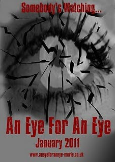
we created a poster of an eye in the middle as our main picture which is conventional. we then added a tagline above the picture 'somebodys watching...' which is also conventional as many genres of film has a tagline on their posters however our tagline works effectively as our tagline symbolises that the 5 victims are being watched which is why we have a silhouette of them inside of the eye.
furthermore after analysing many posters we saw that many of them have a paragraph of very small text at the bottom with credits, website cast etc. so we also included this at the bottom to make our poster more conventional.
we did not challenge any conventions whilst producing out poster as we did with the other 2 products.
How effective is the combination of your main product and ancillary texts?
a main product is usually accompanied by ancillary texts before it is released to the public. our main product is our film trailer and ancillary texts are the magazine and film poster. the ancillary texts are an advertising campaign to advertise the main product being the film. there is a link between all three products which connect them together in order to make them recogniseable by the audience/veiwer/reader.
we have done this connection by using the main image from our magazine cover and turning it into a transparent image and placing it in the eye of the poster, this straight away makes a connection between the two. in addition we have also used the same font of our title on the poster, trailer captions and magazine title. we have also linked the colour scheme f all three products which is red, white and black. colour shceme and font is always a clear indicator for audiences of which film the ancillry texts belong to, it also indicated the genre of the film. ours is obviously horror as it uses red which is a colour which symbolises blood and black which is a dark, dangerous colour.
What have you learned from your audience feedback?
audience feedback for any product is very important. especially with the media products we have produced.
before creating our trailer we conducted a questionnaire for audiences to find out what they like and dont like when it comes to films of the horror genre. this helped us get an idea of our target audience.
just like any film, our trailer had different types of feedback, good and bad.
the main positive feedback we found was the fact that our audience could tell what our genre was straight away as we had used the conventions of horror genres very well. they told us that they could tell the genre straight away from the setting, camera shots, music and colours we had used.
on the other hand, the feedback we received from some was rather negative but eye opening. we were told that our storyline at the start was not shown very well and that the storyline was not very effective. they told us that the bullying scene was good but the way the 'murderers' injury occurred was rather misleading as they said 'how can the eye be damaged by a paper ball'. we were also told that our shots were too fast at times and the storyline did not come across as we didn't highlight key points. our shots were also a little shaky as noticed by the audience. we also received criticism on the music used in our trailer as we were told it wasn't in time with the shots.
we then took on board these negative feedbacks and changed our trailer around a bit. we highlighted the damaging of the eye with a sequence of 3 flash shots. we also highlighted the empty tank of the car with a spotlight to make sure the audience knows where they are meant to be focusing on.
we had no choice but to re shoot some scenes such as the partying in the car because of the feedback we received that the shots were too shaky.
with our music we decided to change the whole thing. we found a new track which was more tension building and we got rid of the heart beat at the end as it was not in time with what was going on. we felt that silence up until the scream was more effective for the audience.
for the film poster and magazine cover, negative feeback was not recived because conventions were followed and we had past experience at doing posters/magazine at AS level.
How did you use media technologies in the construction and research, planning and evaluation stages?
we used different types of technology in the construction and research, planning and evaluation stages. some of which we were familiar with as we used them during our AS task.
-the main technology we used was the apple mac computers which had premier pro for our editing and photoshop for our magazine and poster editing.
-our filming was done on video cameras which the school provided. there were no problems using this as it was straight forward.
we were also provided with a tripod stand to use in order to produce steady shots. this helped us especially with our car scenes.
-our images were taken on a HD cybershot camera as it was good quaity. the images on the magazine cover, poster and shots of our location and cast were taken on this camera.
-after using the wire to put our footage on the computers we had to back up our work on a memory stick to make sure we did not lose work which we had done so far.
-Abdoe premier pro was a very complex programme which we had not used previously so it was hard getting the hang of it. we used this programme to put together our trailer using, sound, captions, cutting out of scenes, changing lighting etc.
-Photo shop was the programme we used to create the magazine and poster. i was already good at using this as i had already used it last year and also have it availiable at home. the main tools i used on this was, the wand to cut out images, the dodge tool, and the text tool.
-we used the internet alot during this coursework as we needed to access many sites. the main one being blogger. blogger was easier to use than first thoughts. it was easier to keep track of than paper/folders and was easy access.
-main websites we used were, youtube for research on other existing trailers and we also uploaded our trailer on there for feedback and to enable us to get an embed code to add our film onto our blog. Google provided us with pictures for our mood boards and analysis'.
Thursday, 5 May 2011
editing of film poster
as a group we decided that on the front of the poster we should have a picture of the killers eye. so we firstly took a picture of this.
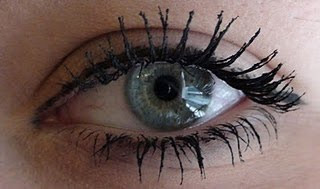
we then decided that making a shattered eye will fit in will with out story made our picture black and white then used the tool to cut out pieces of the eye and moved them slightly to create a shattered effect. we then filled the spaces in with black to create more of an effect. and this worked very well.
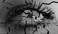
we then stretched out image and added masthead in same same text a our masthead on our magazine. we then added the release date, tagline and website.
we thought this would be our end product, however we were not happy with the way it looked because it was cheap and unattractive. we then thought of other ideas so that we could create a more professional poster.
previously we did not take the picture on a high quality camera so we then decided we should. we then made the picture of the eye black and white in order to ceae a spooky mysterious effect.
within the group there was a suggestion that we should show what the eye can see inside of it. we then took the picture of the victims from the magazine cover and cut around them, we then changed the opacity so that it became more tranparrent. we then placed this image in the middle of the eye and smudged the edges to look more realistic.
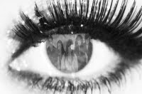
after feeling happy with the image it was time to add text. we then added the title of our film, relase date, credits, and a website which were all placed near the bottom, we then placed the tagline at the top. all these texts were in the same front as the magazine cover masthead.

we then decided that making a shattered eye will fit in will with out story made our picture black and white then used the tool to cut out pieces of the eye and moved them slightly to create a shattered effect. we then filled the spaces in with black to create more of an effect. and this worked very well.

we then stretched out image and added masthead in same same text a our masthead on our magazine. we then added the release date, tagline and website.
we thought this would be our end product, however we were not happy with the way it looked because it was cheap and unattractive. we then thought of other ideas so that we could create a more professional poster.

previously we did not take the picture on a high quality camera so we then decided we should. we then made the picture of the eye black and white in order to ceae a spooky mysterious effect.
within the group there was a suggestion that we should show what the eye can see inside of it. we then took the picture of the victims from the magazine cover and cut around them, we then changed the opacity so that it became more tranparrent. we then placed this image in the middle of the eye and smudged the edges to look more realistic.

after feeling happy with the image it was time to add text. we then added the title of our film, relase date, credits, and a website which were all placed near the bottom, we then placed the tagline at the top. all these texts were in the same front as the magazine cover masthead.
Analysis of film posters
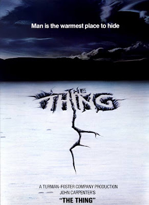
this film poster for the film 'the thing' is quite simple as it does not have much going on. it is a picture of a simple location being cracked ice with a dark, cold background. you can straight away tell that it is a horror movie as it gives you a slight chill when you glance at it due to the colours.
the way the title is writen is very effective as it is on cracked ice. this works very well and looks very appealing to me as an audience.
the tagline is written at the top of the poster on the sky background. the white writing works very well on the black/blue background as it shows up and makes the writing stand out clear.
the infomation at the bottom is very breif as it tells us the production company, the producer/writer and then the title again in small bold writing.
after seeing this poster i think that simple posters are more attractive and apealing. and would make me want to know more if less was given away on a poster.
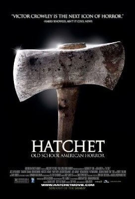
this poster is also very effective which is why i have chosen to write an analysis on it.
the main image on the poster is an axe. this axe is emphasized with lighting around it. this definitly works well on an all black background which it is based on.
on the top is a quote from a newpaper. this is seen quite often on posters for films as it attracts customers with positive feeback.
the title of the film is bellow the top of the axe in bold white writing with the tagline just below it in smaller white writing.
the information/ credits/cast/producers etc. are listed at the bottom of the page in smallest white writing.
i think the color scheme of this poster works really well as it is black and white which is simple but really draws you in. the makes the axe the main focus on the poster which is very good.
initial film poster ideas
Subscribe to:
Comments (Atom)


