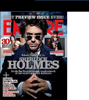
The masthead- the font is large and is in the colour red which makes it appealing for a reader. the red stands out especially as it isagainst the white and black
background.
Main image- the image on the front is of a main character in the movie it is strongly advertising this week which is 'sherlock holmes'. Robert Downey
Jr has a serious look on his face with his fingertips touching. this is extremey large taking up most of the page. it also covers the main name of the magazine. this shows that the magazine is extremely popular and the publishers know that readers will know the name of the magazine without needing the whole words there for them to see.
Headline- the main headline of the magazine is featured over the top of the main image in a grey writing. it is large writing and is placed in the centre of the page which attracts readers straight away.
subheading- this is placed under the headline being 'sherlockholmes'. the subheading is a brief explaination of the heading.
skyline- the skyline is at the top of the magazine and says 'BEST PREVIEW ISSUE EVER' in bold capital letters. skylines such as these are placed at the top in bold as it is one of the first things audiences will see whilst it is on the shelf.
pug- the pug is placed on the left hand upper side of the magazine. it is a white circle with red and black writing inside which reads '30 must see movies'. a pug is made to stand out and this one definitly stands out to the reader.
price, barcode and date are not seen on this magazine. there is a likelihood that these are on the back of the magazine as they are not always made to be on the front.
colours- there is a mixture of colours on this magazine. the background is pale blue, white and black, this works very well with the writing colours which are mainly grey, white and red. the writing is made to stand out on the dark background, especially the red.

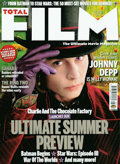
this is the magazine cover for ' total FILM'
The masthead- the masthead is a very large white, bold font which straight away stands out it spells out 'FILM' inside this word is the word 'total' in vibrant red writing. this is very effective and creative.
Main image- the main image of the poster is johnny depp in his wonderful costume for a film. his picture is very eye catching and mysterious. if it couldnt be any clearer that the image is johnny depp his name is also shown on the right hand side in bold white writing.
Headline- the main headline of this magazine is in grey bold writing which make sit stand out on the dark black/red back ground it is placed on over the image.
sub headline- the subline is in white writing, once again helping it stand out on the background it is placed on.
skyline- the skyline is at the top of the magazine but this time underneath the masthead and in smaller font. this doesnt look as effective as the last magazine cover. however this is persuasive and still draws the reader in.
pug-the pug is a red circular stamp, situated in the left hand upper side of the magazine inside in white writing it tells the reader what to expect inside. the white writing on the vibrant red stands out catching the eye of the reader/audience.
barcode- the barcode is placed under one of the storylines. it is not clear to see whther there is an issue date. however i am assuming the price is labelled clearly on the barcode.
colours- the colours on this magazine which consist of green and red and white are very vibrant colours and are good in darwing the reader in and attracting them to the magazine.
No comments:
Post a Comment