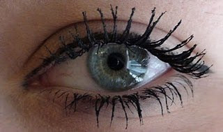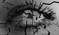
we then decided that making a shattered eye will fit in will with out story made our picture black and white then used the tool to cut out pieces of the eye and moved them slightly to create a shattered effect. we then filled the spaces in with black to create more of an effect. and this worked very well.

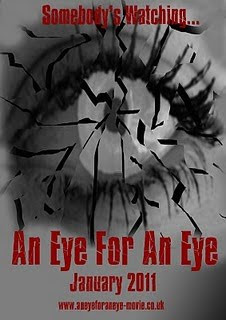
we then stretched out image and added masthead in same same text a our masthead on our magazine. we then added the release date, tagline and website.
we thought this would be our end product, however we were not happy with the way it looked because it was cheap and unattractive. we then thought of other ideas so that we could create a more professional poster.

previously we did not take the picture on a high quality camera so we then decided we should. we then made the picture of the eye black and white in order to ceae a spooky mysterious effect.
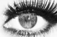
within the group there was a suggestion that we should show what the eye can see inside of it. we then took the picture of the victims from the magazine cover and cut around them, we then changed the opacity so that it became more tranparrent. we then placed this image in the middle of the eye and smudged the edges to look more realistic.

after feeling happy with the image it was time to add text. we then added the title of our film, relase date, credits, and a website which were all placed near the bottom, we then placed the tagline at the top. all these texts were in the same front as the magazine cover masthead.
No comments:
Post a Comment