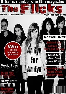
we then uploaded the chosen image onto Abdoe Photoshop ready to be edited. we felt that by making the image black and white and by playing around with the contrast and brightness it would help to create the horror feel.
after we were happy about the look of the image we stretched it to fit the page, however in orger to keep the image in good quality after stretching we pressed the pin.
for where the masthead was going to be placed we added a cold greyish background, this would help the masthead become much more noticable.
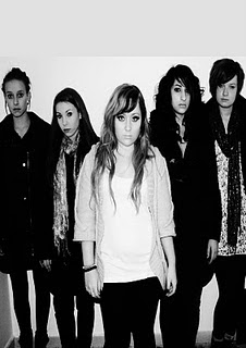
we then decided on the skyline and decided it would go right at the top on a black background with bold white writing to help it stand out and catch the audiences eye.
a font was found on the internet for out main masthead. this was filled in black. we then pasted the exact same font ontop but this time in red and placed it ontop to create and outlined 3d efect title.
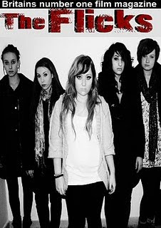
we then as a group decided to add a pug to out magazine. we used a cirular tool to create a red cirle and we then created a larger white circle to create a boarder around it. we then placed white writing in the middle of the pug which stood out because white on red is very appealing.
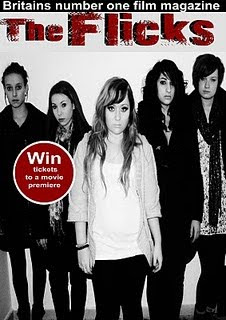
we then as a group decided out date, website and issue number would be shown on the front cover so we added this text underneath the masthead in black font so it stands out and can be seen and found easily.
after this the main bits were placed on our magazine we just had to add some text. our text are black and red black and red black and red and so on to create a patteren and also to go with the colourscheme of our magazine
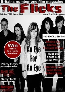
the last stage was to add a barcode which was simple as it was taken from the internet then pasted onto our magazine all we had to do was adjust the size and the whereabout of it. we chose to put it in the bottom right hand corner away from the image so that it is not obstructing anything on the page.
No comments:
Post a Comment