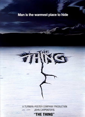
this film poster for the film 'the thing' is quite simple as it does not have much going on. it is a picture of a simple location being cracked ice with a dark, cold background. you can straight away tell that it is a horror movie as it gives you a slight chill when you glance at it due to the colours.
the way the title is writen is very effective as it is on cracked ice. this works very well and looks very appealing to me as an audience.
the tagline is written at the top of the poster on the sky background. the white writing works very well on the black/blue background as it shows up and makes the writing stand out clear.
the infomation at the bottom is very breif as it tells us the production company, the producer/writer and then the title again in small bold writing.
after seeing this poster i think that simple posters are more attractive and apealing. and would make me want to know more if less was given away on a poster.

this poster is also very effective which is why i have chosen to write an analysis on it.
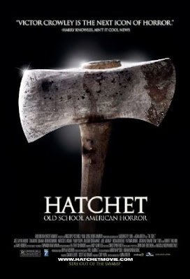
the main image on the poster is an axe. this axe is emphasized with lighting around it. this definitly works well on an all black background which it is based on.
on the top is a quote from a newpaper. this is seen quite often on posters for films as it attracts customers with positive feeback.
the title of the film is bellow the top of the axe in bold white writing with the tagline just below it in smaller white writing.
the information/ credits/cast/producers etc. are listed at the bottom of the page in smallest white writing.
i think the color scheme of this poster works really well as it is black and white which is simple but really draws you in. the makes the axe the main focus on the poster which is very good.
No comments:
Post a Comment