In what ways does your media product use, develop or challenge forms and conventions of real media products?
Movie Trailer-
after deciding to create a horror movie trailer before going to film myself and my group researched and analysed existing horror movie trailers, magazine covers and posters in order to get an idea of what we needed to include in each of these and what similarities each trailer, magazine and poster had to eachother. the main convention which is the most important one we followed is the convention of freytag's pyramid theory. his theory says that most films of any genre have an equillibrium, a climax and a fall in the action. the way this theory is used in our trailer is from the start we have a normal, calm group of school girls setting off on an adventure where everything looks fine and the shots are longer, not far into the trailer the shots then become shorter as we enter the climax with the killings, the action then suddenly starts to fall as we show the murderer starting to look up. however we challenged the conventions as we added another action clip at the end with a victim screaming. our group then dicussed that although it does no fit in with freytag's theory it is partly a convention of some horror films to have another action shot like ours at the end.
an example of another convention we followed after we analysed horror movie trailers and noticed they all had a logo of a production company in which the trailer was made by so we decided we needed on in the start of our trailer too so we produced one ourselves on photoshop and named it studio sisters company productions. whilst analysing trailers we also realised that the production company alters the colours and background of their logo in order to fit in with the genre of the film so we created a dark black and grey logo with dark clouds behind.
we also researched different sounds/music within trailers so that we could decide on what kind of music to include in ours. we used non digetic music which had a horror sound to it. at the end of our trailer we faded the music until it completely cut out, then we added the scream of the victim as digetic sound which worked very well as it created tension and shocked the viewers.
another conventional theme which we found whilst looking at trailers is that the shots at the equilibrium stage are longer shots than when the climax is taking place. so we used longer shots at the start to explain the story but as the climax entered out shots were short in order to build tension. the shots were fast like the audiences heartbeat would be as they are watching the trailer.
our location was also conventional. horror films usually take place in locations with no easy escape or no escape at all with dark and creepy scenery. this is why our filming for the climax of our trailer took place in a dark and isolated forest during the night.
we analysed many horror trailers and and have included many conventions our own media product in order to keep with the conventions of horror films as explained above, however we have also developed and challenged many of the conventions to make it more appealing and unique.
the main convention we challenged was the fact that our characters were not conventional to a horror movie. our cast was an all girl cast including the antagonist which is very unconventional as most horrors use a mix of both genders and the antagonist is usually a male as we have researched this. we have challenged the convention that all murderers are male but we have also challenged the fact that men are the tougher character because due to our all female cast the survivor is a girl. even though we cannot tell this from the trailer it is obvious one of them is going to survive as this is conventional of a horror film as they usually have a sequal including the surviving character in it.
Magazine-
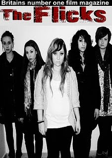
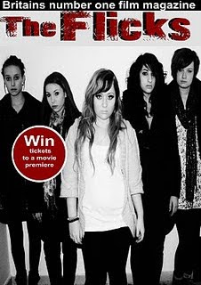
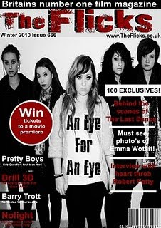
our magazine follows many conventions as we have used taglines, skylines, main image, pugs, headlines, subheadlines, barcodes, prices etc. our pug is placed over the image with an advertisement inside of it. our title 'the flicks' is situated on the top of the magazine which is conventional of most magazines. our barcaode is on the cover at the bottom right hand corner and our main image is placed in the middle. we decided to do the above in this way as we found these were conventional on the magazines we have analysed as a group.
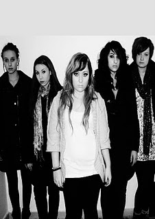
one of the main conventions which we challenged was the main image on the cover. after analysing many magazines including the ones on my blog we found that magazines usually include a picture of a main character or surviver in a film on the cover. the way we challenged this was by including a picture of the whole cast except the murderer. the reason for this was because we felt firstly if our product was really published we would have wanted to keep the murderers identity and outfit hidden until the veiwers see the film for themselves so we didnt want to include the murderer on the cover. and we felt using all 5 victims would make it more appealing to readers.
another convention we follwed with out magazine was the colour scheme. we found that magazine covers usually include the colour scheme of the film which is being shown on the cover. for example, as we used the colours white, red and black in our trailer and poster we decided to use these colours on the magazine also.
Poster-
our poster is most conventional of the 3 pieces we have produced as we have included all of the elements of a real poster onto our own.
we created a poster of an eye in the middle as our main picture which is conventional. we then added a tagline above the picture 'somebodys watching...' which is also conventional as many genres of film has a tagline on their posters however our tagline works effectively as our tagline symbolises that the 5 victims are being watched which is why we have a silhouette of them inside of the eye.
furthermore after analysing many posters we saw that many of them have a paragraph of very small text at the bottom with credits, website cast etc. so we also included this at the bottom to make our poster more conventional.
we did not challenge any conventions whilst producing out poster as we did with the other 2 products.
How effective is the combination of your main product and ancillary texts?
a main product is usually accompanied by ancillary texts before it is released to the public. our main product is our film trailer and ancillary texts are the magazine and film poster. the ancillary texts are an advertising campaign to advertise the main product being the film. there is a link between all three products which connect them together in order to make them recogniseable by the audience/veiwer/reader.
we have done this connection by using the main image from our magazine cover and turning it into a transparent image and placing it in the eye of the poster, this straight away makes a connection between the two. in addition we have also used the same font of our title on the poster, trailer captions and magazine title. we have also linked the colour scheme f all three products which is red, white and black. colour shceme and font is always a clear indicator for audiences of which film the ancillry texts belong to, it also indicated the genre of the film. ours is obviously horror as it uses red which is a colour which symbolises blood and black which is a dark, dangerous colour.
What have you learned from your audience feedback?
audience feedback for any product is very important. especially with the media products we have produced.
before creating our trailer we conducted a questionnaire for audiences to find out what they like and dont like when it comes to films of the horror genre. this helped us get an idea of our target audience.
just like any film, our trailer had different types of feedback, good and bad.
the main positive feedback we found was the fact that our audience could tell what our genre was straight away as we had used the conventions of horror genres very well. they told us that they could tell the genre straight away from the setting, camera shots, music and colours we had used.
on the other hand, the feedback we received from some was rather negative but eye opening. we were told that our storyline at the start was not shown very well and that the storyline was not very effective. they told us that the bullying scene was good but the way the 'murderers' injury occurred was rather misleading as they said 'how can the eye be damaged by a paper ball'. we were also told that our shots were too fast at times and the storyline did not come across as we didn't highlight key points. our shots were also a little shaky as noticed by the audience. we also received criticism on the music used in our trailer as we were told it wasn't in time with the shots.
we then took on board these negative feedbacks and changed our trailer around a bit. we highlighted the damaging of the eye with a sequence of 3 flash shots. we also highlighted the empty tank of the car with a spotlight to make sure the audience knows where they are meant to be focusing on.
we had no choice but to re shoot some scenes such as the partying in the car because of the feedback we received that the shots were too shaky.
with our music we decided to change the whole thing. we found a new track which was more tension building and we got rid of the heart beat at the end as it was not in time with what was going on. we felt that silence up until the scream was more effective for the audience.
for the film poster and magazine cover, negative feeback was not recived because conventions were followed and we had past experience at doing posters/magazine at AS level.
How did you use media technologies in the construction and research, planning and evaluation stages?
we used different types of technology in the construction and research, planning and evaluation stages. some of which we were familiar with as we used them during our AS task.
-the main technology we used was the apple mac computers which had premier pro for our editing and photoshop for our magazine and poster editing.
-our filming was done on video cameras which the school provided. there were no problems using this as it was straight forward.
we were also provided with a tripod stand to use in order to produce steady shots. this helped us especially with our car scenes.
-our images were taken on a HD cybershot camera as it was good quaity. the images on the magazine cover, poster and shots of our location and cast were taken on this camera.
-after using the wire to put our footage on the computers we had to back up our work on a memory stick to make sure we did not lose work which we had done so far.
-Abdoe premier pro was a very complex programme which we had not used previously so it was hard getting the hang of it. we used this programme to put together our trailer using, sound, captions, cutting out of scenes, changing lighting etc.
-Photo shop was the programme we used to create the magazine and poster. i was already good at using this as i had already used it last year and also have it availiable at home. the main tools i used on this was, the wand to cut out images, the dodge tool, and the text tool.
-we used the internet alot during this coursework as we needed to access many sites. the main one being blogger. blogger was easier to use than first thoughts. it was easier to keep track of than paper/folders and was easy access.
-main websites we used were, youtube for research on other existing trailers and we also uploaded our trailer on there for feedback and to enable us to get an embed code to add our film onto our blog. Google provided us with pictures for our mood boards and analysis'.
Thursday, 5 May 2011


editing of film poster
as a group we decided that on the front of the poster we should have a picture of the killers eye. so we firstly took a picture of this.
we then decided that making a shattered eye will fit in will with out story made our picture black and white then used the tool to cut out pieces of the eye and moved them slightly to create a shattered effect. we then filled the spaces in with black to create more of an effect. and this worked very well.
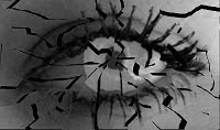
we then stretched out image and added masthead in same same text a our masthead on our magazine. we then added the release date, tagline and website.
we thought this would be our end product, however we were not happy with the way it looked because it was cheap and unattractive. we then thought of other ideas so that we could create a more professional poster.
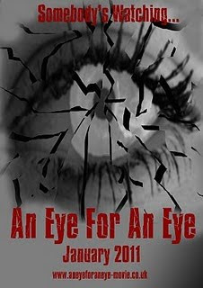
previously we did not take the picture on a high quality camera so we then decided we should. we then made the picture of the eye black and white in order to ceae a spooky mysterious effect.
within the group there was a suggestion that we should show what the eye can see inside of it. we then took the picture of the victims from the magazine cover and cut around them, we then changed the opacity so that it became more tranparrent. we then placed this image in the middle of the eye and smudged the edges to look more realistic.
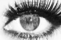
after feeling happy with the image it was time to add text. we then added the title of our film, relase date, credits, and a website which were all placed near the bottom, we then placed the tagline at the top. all these texts were in the same front as the magazine cover masthead.
Analysis of film posters

this film poster for the film 'the thing' is quite simple as it does not have much going on. it is a picture of a simple location being cracked ice with a dark, cold background. you can straight away tell that it is a horror movie as it gives you a slight chill when you glance at it due to the colours.
the way the title is writen is very effective as it is on cracked ice. this works very well and looks very appealing to me as an audience.
the tagline is written at the top of the poster on the sky background. the white writing works very well on the black/blue background as it shows up and makes the writing stand out clear.
the infomation at the bottom is very breif as it tells us the production company, the producer/writer and then the title again in small bold writing.
after seeing this poster i think that simple posters are more attractive and apealing. and would make me want to know more if less was given away on a poster.

this poster is also very effective which is why i have chosen to write an analysis on it.
the main image on the poster is an axe. this axe is emphasized with lighting around it. this definitly works well on an all black background which it is based on.
on the top is a quote from a newpaper. this is seen quite often on posters for films as it attracts customers with positive feeback.
the title of the film is bellow the top of the axe in bold white writing with the tagline just below it in smaller white writing.
the information/ credits/cast/producers etc. are listed at the bottom of the page in smallest white writing.
i think the color scheme of this poster works really well as it is black and white which is simple but really draws you in. the makes the axe the main focus on the poster which is very good.
initial film poster ideas
before starting off our film poster we created a few ideas of the structure and layout of the poster and where we would like things to go.


editing process of film magazine
first things first we needed a picture of the whole cast to put on the front cover as we all decided it would be a good idea to use the whole cast as the main image. after taking many different photos we all decided on the one we wanted to use.
we then uploaded the chosen image onto Abdoe Photoshop ready to be edited. we felt that by making the image black and white and by playing around with the contrast and brightness it would help to create the horror feel.
after we were happy about the look of the image we stretched it to fit the page, however in orger to keep the image in good quality after stretching we pressed the pin.
for where the masthead was going to be placed we added a cold greyish background, this would help the masthead become much more noticable.
we then decided on the skyline and decided it would go right at the top on a black background with bold white writing to help it stand out and catch the audiences eye.
a font was found on the internet for out main masthead. this was filled in black. we then pasted the exact same font ontop but this time in red and placed it ontop to create and outlined 3d efect title.
we then as a group decided to add a pug to out magazine. we used a cirular tool to create a red cirle and we then created a larger white circle to create a boarder around it. we then placed white writing in the middle of the pug which stood out because white on red is very appealing.
we then as a group decided out date, website and issue number would be shown on the front cover so we added this text underneath the masthead in black font so it stands out and can be seen and found easily.
after this the main bits were placed on our magazine we just had to add some text. our text are black and red black and red black and red and so on to create a patteren and also to go with the colourscheme of our magazine
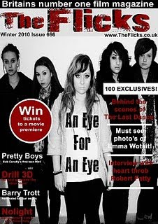
the last stage was to add a barcode which was simple as it was taken from the internet then pasted onto our magazine all we had to do was adjust the size and the whereabout of it. we chose to put it in the bottom right hand corner away from the image so that it is not obstructing anything on the page.
we then uploaded the chosen image onto Abdoe Photoshop ready to be edited. we felt that by making the image black and white and by playing around with the contrast and brightness it would help to create the horror feel.
after we were happy about the look of the image we stretched it to fit the page, however in orger to keep the image in good quality after stretching we pressed the pin.
for where the masthead was going to be placed we added a cold greyish background, this would help the masthead become much more noticable.

we then decided on the skyline and decided it would go right at the top on a black background with bold white writing to help it stand out and catch the audiences eye.
a font was found on the internet for out main masthead. this was filled in black. we then pasted the exact same font ontop but this time in red and placed it ontop to create and outlined 3d efect title.

we then as a group decided to add a pug to out magazine. we used a cirular tool to create a red cirle and we then created a larger white circle to create a boarder around it. we then placed white writing in the middle of the pug which stood out because white on red is very appealing.

we then as a group decided out date, website and issue number would be shown on the front cover so we added this text underneath the masthead in black font so it stands out and can be seen and found easily.
after this the main bits were placed on our magazine we just had to add some text. our text are black and red black and red black and red and so on to create a patteren and also to go with the colourscheme of our magazine

the last stage was to add a barcode which was simple as it was taken from the internet then pasted onto our magazine all we had to do was adjust the size and the whereabout of it. we chose to put it in the bottom right hand corner away from the image so that it is not obstructing anything on the page.

Analysis of film magazines
this is a magazine cover from 'Empire' with the film Sherlock holmes on the front cover.
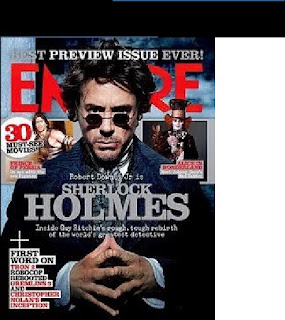
The masthead- the font is large and is in the colour red which makes it appealing for a reader. the red stands out especially as it isagainst the white and black
background.
Main image- the image on the front is of a main character in the movie it is strongly advertising this week which is 'sherlock holmes'. Robert Downey
Jr has a serious look on his face with his fingertips touching. this is extremey large taking up most of the page. it also covers the main name of the magazine. this shows that the magazine is extremely popular and the publishers know that readers will know the name of the magazine without needing the whole words there for them to see.
Headline- the main headline of the magazine is featured over the top of the main image in a grey writing. it is large writing and is placed in the centre of the page which attracts readers straight away.
subheading- this is placed under the headline being 'sherlockholmes'. the subheading is a brief explaination of the heading.
skyline- the skyline is at the top of the magazine and says 'BEST PREVIEW ISSUE EVER' in bold capital letters. skylines such as these are placed at the top in bold as it is one of the first things audiences will see whilst it is on the shelf.
pug- the pug is placed on the left hand upper side of the magazine. it is a white circle with red and black writing inside which reads '30 must see movies'. a pug is made to stand out and this one definitly stands out to the reader.
price, barcode and date are not seen on this magazine. there is a likelihood that these are on the back of the magazine as they are not always made to be on the front.
colours- there is a mixture of colours on this magazine. the background is pale blue, white and black, this works very well with the writing colours which are mainly grey, white and red. the writing is made to stand out on the dark background, especially the red.
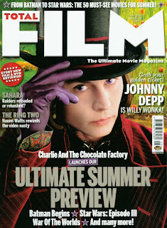
this is the magazine cover for ' total FILM'
The masthead- the masthead is a very large white, bold font which straight away stands out it spells out 'FILM' inside this word is the word 'total' in vibrant red writing. this is very effective and creative.
Main image- the main image of the poster is johnny depp in his wonderful costume for a film. his picture is very eye catching and mysterious. if it couldnt be any clearer that the image is johnny depp his name is also shown on the right hand side in bold white writing.
Headline- the main headline of this magazine is in grey bold writing which make sit stand out on the dark black/red back ground it is placed on over the image.
sub headline- the subline is in white writing, once again helping it stand out on the background it is placed on.
skyline- the skyline is at the top of the magazine but this time underneath the masthead and in smaller font. this doesnt look as effective as the last magazine cover. however this is persuasive and still draws the reader in.
pug-the pug is a red circular stamp, situated in the left hand upper side of the magazine inside in white writing it tells the reader what to expect inside. the white writing on the vibrant red stands out catching the eye of the reader/audience.
barcode- the barcode is placed under one of the storylines. it is not clear to see whther there is an issue date. however i am assuming the price is labelled clearly on the barcode.
colours- the colours on this magazine which consist of green and red and white are very vibrant colours and are good in darwing the reader in and attracting them to the magazine.
Initial Ideas for Magazine
before we started our magazine cover we produced some templates of the structure of different magazine covers we could use. we created a few on microsoft word.


editing process of trailer
the editing process of the traler was the most time consuming and difficult part.
we firstly had to film our footage on a HD digital video recorder.

after putting our footage on the mac computers we imported the footage onto the program called Adobe Premiere Pro to edit the footage.
once the pieces of footage were in the sidebar we were then able to drag the footage we wanted into the timeline below so that we could cut and edit.
after deciding which pieces of footage we wanted to use we put them roughly where abouts we wanted the footage to go. for example, the story telling shots would go near the begining as it is explaining the story.
when inserted on the timeline we were then able to play around with the footage to see if we were pleased about the footage we chose and the way we layed it out. it was useful when we highlighted many pieces of footage so that we could move them all at once instead of moving them one by one and having to organise them again.
the tool we used the most was the razor blade tool as we cut down many bits of our footage. an as we wanted to create quick paced shots, loads were cut out.
due to the whether conditions on the day we filmed our shots did not have many good effects so we used the dip tool to add these extra effects and to create the sense of fear and danger.
just like any trailer we had many captions which tell the audience the breif storyline of the film. to fit in with the horror genre we chose to do our red captions on a black background. our original font did not pelase many people as we were told it was dull and un appealing. we then picked a more vibrant red and a more attractive font which was near enough 3d style. this critisism helped us because we were able to improve on this.
music was one of the hardest parts to add into our trailer.
we had diegetic sound in a trailer however we also added a non digetic music to create more effect. we changed our music more than once. at first our music was soft then built up but then our final peice had a steady pace all through as we felt it kept a sense of suspense for the audience. the razor tool once again helped cut the music down and place it where we wanted. getting the timing right was the music was very difficult.
after reviewing our trailer back we then decided to make the begining storyline section black and white to create it as thought it is a flashback and that a stroy is being told.
in the end when we were all happy that nomore could be added the clip was rendered and compelte.
we firstly had to film our footage on a HD digital video recorder.
after putting our footage on the mac computers we imported the footage onto the program called Adobe Premiere Pro to edit the footage.
once the pieces of footage were in the sidebar we were then able to drag the footage we wanted into the timeline below so that we could cut and edit.
after deciding which pieces of footage we wanted to use we put them roughly where abouts we wanted the footage to go. for example, the story telling shots would go near the begining as it is explaining the story.
when inserted on the timeline we were then able to play around with the footage to see if we were pleased about the footage we chose and the way we layed it out. it was useful when we highlighted many pieces of footage so that we could move them all at once instead of moving them one by one and having to organise them again.
the tool we used the most was the razor blade tool as we cut down many bits of our footage. an as we wanted to create quick paced shots, loads were cut out.
due to the whether conditions on the day we filmed our shots did not have many good effects so we used the dip tool to add these extra effects and to create the sense of fear and danger.
just like any trailer we had many captions which tell the audience the breif storyline of the film. to fit in with the horror genre we chose to do our red captions on a black background. our original font did not pelase many people as we were told it was dull and un appealing. we then picked a more vibrant red and a more attractive font which was near enough 3d style. this critisism helped us because we were able to improve on this.
music was one of the hardest parts to add into our trailer.
we had diegetic sound in a trailer however we also added a non digetic music to create more effect. we changed our music more than once. at first our music was soft then built up but then our final peice had a steady pace all through as we felt it kept a sense of suspense for the audience. the razor tool once again helped cut the music down and place it where we wanted. getting the timing right was the music was very difficult.
after reviewing our trailer back we then decided to make the begining storyline section black and white to create it as thought it is a flashback and that a stroy is being told.
in the end when we were all happy that nomore could be added the clip was rendered and compelte.
Filming
Below i am going to write the dates we filmed and explain what we doneand where we filmed on those days.
however before i explain the filming schedule we currently filmed in november times however our filming schedule was pretty hectic as we suffered a few problems before hand.
our footage was deleted off of the cameras as we did not upload the recordings onto the mac computers straight away. so after filming first time in november we then had to re film everything. Due to this our group suffered during to the lack of timing and planning. from then on we made sure that we were thoroughly organised and planned so that these mistakes did not occure again.
1st of december- due to the mistakes of filming first time round we then refilmed our scenes of the car. this filming took place on leutenant ellis way.
with the camera we were stood on a bridge so that we could produce a high angle shot of the car passing by. Due to the cold and snowy whether conditions this time around the shots were not as good as we has hoped and we had to look past it.
3rd of december- we went to a local forest in order to capture the murdering scenes and we thought this was the most effective place as it was dark and mysterious.
we had taken different shots of each murder so that we could decide on the most suitable one after we had put them on the computer.
4th of december- on this date we shot scenes of the characters in the car having a good time before heading off. we shot long angle, close ups and side shots as it was hard finding the right shot so we could chose the most effective shot once again on the computers and it is good to always have more than one different shot of each scene to see which works better.
13th of december- we filmed the start of the trailer which is the part which explains the story. this took place in a classroom and a corridoor in school. to explain the story thoroughly we took many different angle shots and it was extremely effective when we made the quick paced trailer.
14th of december- on this date we filmed the breakdown scenes these took place in the car as we showed the petrol running out. we also filmed the shot of the girl who then turned into the killer in the toilets tending to her eye due to the bullying.
Target Audience
Before releasing any film it will need to be clear on the target audience which the produced film will be aimed at, certificates of a film are decided by the British Board of Film Classification. it can include, race, age, gender or even class.
target audience is very important as you need to know who and which age group you are aiming your film at.
we chose a horror film so we then straight away decided it should be an 18 as we are 17-18 year olds our selves it would be easy for us to aim our film at teenagers our own age, and we wanted a restricted age for our movie. our film could have been aimed at the certifcate 15 but the killing scenes if the actual film was produced would be for 18 year olds as 15 year olds may find it disturbing or frieghtening due to grapic images. However we came to a conclusion that it would be targetted at males and females and not just one catergory. Girls may enjoy the film as it is an all girl cast and boys may enjoy it for the same reason and may be intregued to see all girls in a horror movie even if it is to make fun of them.
There is no typical stereotype of a teenager which our film is aimed at as we wanted a whole variety of young people to watch it. this is the reason why we have a range of different characters in our film, from a geek, to a bimbo.
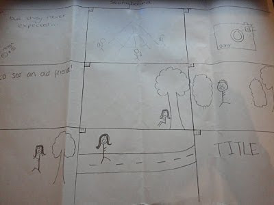
Final Storyboard
this is our final story board after discussing ideas and putting different parts together we came up with an idea which we feel will work very well with the contribution of the different ideas from our initial storyboards.
These storyboards will help us get started as we now know the story behind the film we are supposedly shooting the trailer for.
these stroyboards do not mean that our trailer will follow the exact same structure but it will help us.
These storyboards will help us get started as we now know the story behind the film we are supposedly shooting the trailer for.
these stroyboards do not mean that our trailer will follow the exact same structure but it will help us.


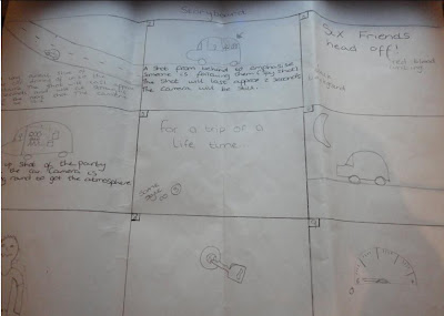
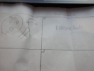
initial Story Board
A storyboard had to be produced in order for us to know what our story would be, what shots we thought would work best and where it would take place, taking into account our horror genre. We all drew storyboards in pairs and individually so that would could get many different ideas.

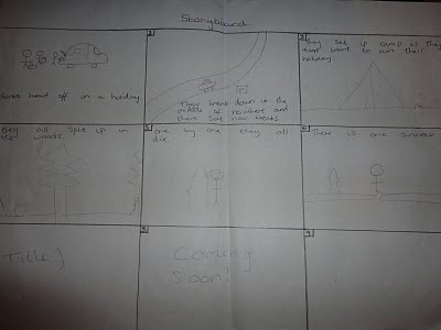
initial ideas


to start off within our group we had to think of a genre and a storyline so that we could start our planning our shots, sound, mise en-scne and location. we then produced an initial story board with our first idea on it. Our initial story board shows how we origianlly planned our trailer to look and our final storyboard shows how we improved and progressed using eachothers ideas to create the final piece.
Within the group we agreed on a horror movie so we then started to brainstorm our ideas of what we thought a horror movie would contain. However, when deciding on our characters we all argeed that we should have unconventinal characters fr example a typical blonde bimbo however she is actually clever and it is the geek look alike whi is the less intelligent one.
the last thing we came up with was the name of the film because we had a few ideas which we all liked, such as, revenge eye for an eye, trapped.

Mis-en Scene
Many films follow the same conventions when it comes to mise-en scene.
in horror films the killer is usually wearing dark clothes and their identity is most commonly hidden to create a sense of mystery.
The lighting is normally dark, shadowed and gloomy . Horror films usually take place during the night as it sets the right theme and provides effects of it's own.
The way the filming is shoty is also the same in most horror movies.
to create a sense of tension there are many quick and snappy shot.
in order to symbolise that someone is being watched or even followed shots are taken from behind the victim.
the audience is sometimes shown the percepctive of the character, as if the audience is really in the movie.
in our trailer we have used these horror movie conventions as we feel that it is what makes a horror film, horror.
the killer in our trailer is dressed in all black clothing, our killer also wore an eye patch so we have covered ger face in someway which is a big convention of horror films.
We filmed most of our trailer during the night as we felt this would be good in portraying the horror genre as most horror films are filmed at night to create the sense of danger, horror and fear.
we have also used many different shots including, behind shots, and many quick paced shots throughout our trailer.
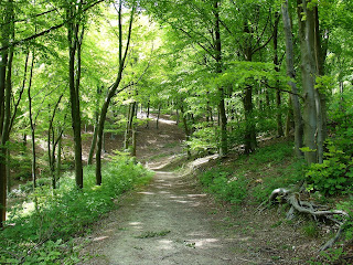
Location analysis
the location of a horror movie is usually in a dark, haunted looking, trapped area. we chose a forest situated near us so it was easy to get to and safe to film in. after filiming our first practice scene we agreed it fittd well with the genre we were aiming for
Sound and Music
sound is a large part in creating a trailer as the music helps the audience feel the genre that the film is. for example in a horror movie the music is tense which also leaves the audience feeling tense and really helps them connect with the character.
So for our movie trailer we started off with soft music and as the equilibrium was disrupted the music changed to a more rock/scary music to create a real sence of tension and suspension.
Near the end of the trailer the music cuts out and all that there is to hear is a heartbeat which the audience can relate to as the trailer gets your heart racing. Then when you least expect it there is a scream right at the end this creates even more tension then cuts out. this creates a real sense of scariness and will leave the audience wanting more.
Character analysis
As a group we decided that we would have unconventional characters so we have goe with a very different idea.
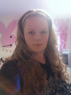
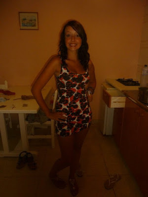
After analysing typical horror films it seemed that the villian was usually the male, so we have gone for a female killer. We have chose Jodie (as shown below) as the murderer as we feel she is not the type of girl you would look at and think she looks like the evil type. she has a sweet, kind and loving look to her so using her as the villian in the film would be a shock to the audience and make it much more interesting to watch as it would be less predictable.
Before choosing her as the villian Jodie shared with us that she has a past of being bullied so she has all the emotions and can use these emotions during filming which made it much more realistic for her and for the audience.
the typical survivor in a horror film would be thought to be the strong man! however we have chosen a girl to be the survivor. Philippa looks like your usual dumb blonde bimbo as she is short aswell however she is far from that. She is the clever one out the group. so we added this twist so we could be unconventional once again.
Geeks are always seen to be the clever ones just because of the way they look. However, we have decided to use a girl who looks like a geek but is however the least intelligent one out of the group. She becomes the first to die.
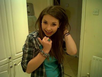
we also have a loud girl, Miranda, who is seen as the leader of the pack. she drives the car in the trailer so you can tell that she tries to be the controller of every situation.
every group has a dopey girl. Natalie was chosen for this role as she is usually a little dopey in real life so it would be easy for her to get into character. It was good to have a girl like this as you sometimes have funny parts in a horror movie and this character would help to create these parts.
Kelsey is the tom boy of the group. we have an all female cast so having a tom boy would be good to show a little masculinity within the film. we chose kelsey because just like natalie the dopey one, kelsey is a tom boy in real life so she can also find it easy to get into her character.
Mood Board
This mood board consists of different picutres from horror trailers. This will help me to draw out typical colours, characters, themes and lighting.
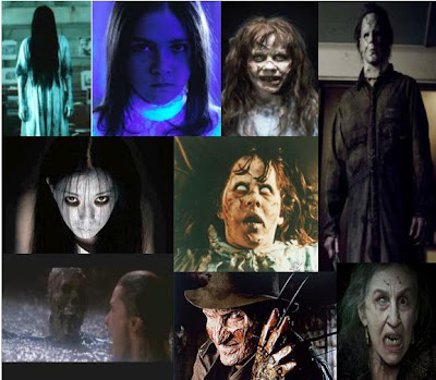
From the photos i have gathered it is clear that horror genre films follow the same conventions of dark, gloomy colours to set a creepy theme.
The killer is most commonly wearing a mask, has scars or a distorted face. The audience rarely see the real face of the anti-protagonist being the killer

From the photos i have gathered it is clear that horror genre films follow the same conventions of dark, gloomy colours to set a creepy theme.
The killer is most commonly wearing a mask, has scars or a distorted face. The audience rarely see the real face of the anti-protagonist being the killer
Detailed analysis of a horror trailer
THE ORPHAN-
this is a horror film which is about a couple who have previously lost their daughter so decide to adopt a child who is a 9 year old. They believe she has the potential to be a part of their family, however, the following events prove that she is far from a little 9 year old orphan who wants to be loved.
Ethner who is the orphan in the film turns out to be a murderer who isn't actually a little girl.
i will be analysing this trailer, whilst outlining the camera angles, editing, location it takes place, sound and mise-en-scene.
First off all the there are many different camera angles used within this trailer. The angles used draw the audiences attention and causing them to sit there tense and in suspision about what it's all about. The shot which really come to my attention was the shot of ethner as she screams and the camera is very close up to her face and instead of the camera being held steady it is infact unsteady causing suspision and making it come to life much more! There is a good example of equilibirum, it all start off perfectly until it is disrupted by ethner's actions. and the camera angles show this disruption with the jump shots throughout.
The editing in the trailer is very clever and also drew my attention. the trailer starts off with smooth shots merging from one scene to another however as we approach the middle of the trailer the shots become more jumpy and short, they tend to jump from one shot to another in the space of 1-2 seconds. this creates great attention and leaves the audience wanting to watch the trailer as it doesn't give much away.
There are many locations which this film takes place in. not only does it take place in a house which looks rather unsettling but it also takes place in places such as modern schools, orphanage, hospitals.
The mise-en-scene is very interesting. the movie looks very modern. everybody is dressed modern, the cars and houses are modern, however, esther is the only person who looks as though she belongs in a victorian film. her clothes look like rags from centuries ago and her hair is also un modern this tells the audience straight away that esther is not normal and it gets the audience thinking.
Sound plays a very important part in a trailer especially a horror movie. it builds the tension and allows the audience to feel the tension which is being let off by the sound.
The music starts off sweet then desends to a much louder attention grabbing noise. the music is broken when esther screams in the toilet building up more suspense. throughout the trailer the sound keeps the audience glued to the screen even if they are scared because it draws them in.
Analysis of Horror Genre
I am going to write a description of the characters, music, setting and mis en scene within horror films.
Horror films are usually very gloomy and dark which sets the scene of horror. Dark places usually portray a sense of mystery; it also builds tension for the audience due to the gloominess and darkness.
As well as effecting the audience it creates tension for the characters within the film.
The music in horror films also build the tensions, it starts off slow but slowly builds up whenever there is a sense of danger or fear.
Along with the music and colours tension can be built up by the way the film is shot. Quick shots also create a sense of danger and help to portray the horror theme.
In horror films it is commonly set in an abandoned area which provides no way out for the victims leaving them trapped. They are set in scary locations, which straight away leave the audience unsettled as they know the location is a symbol of danger about to occur.
When watching a film without being introduced to the characters the audience can tell what kind of person the character is but the way they are presented in their dress sense or expressions. The victims in horror films are usually nicely dressed like any normal person, however, during the climax moments the victims costume becomes worn down with blood, sweat, dirt etc. this also applies to the characters facial expressions as they start off happy then the danger and fear starts to show in their face which also builds the tension for the audience and helps them to sympathise with the character imagining themselves in the characters position.
Overall horror films commonly follow these popular conventions as it helps to set the genre and makes the audience recognise what genre of film they are watching.
Film Trailers and Teaser Trailers
This is the full theatrical for the movie Silent Hill.
a theatrical movie trailer is around three times the length of a teaser trailer. it is designed to tell the story but not give too much away so that the audience can become interested and go to watch the film. These trailers include more narration, more of the characters starring in the film, much more variety of camera shots and much more writing.
This is the teaser trailer for the movie Silent Hill.
This type of trailer is designed to give you and insight into what to expect before the film is out and is a very short clip usually consisting of between 30 seconds and a minute. these trailers are produced very early on in the production stage. They look simple and are meant to be very simple, it is to get the audience excited for what there is to come in the next few months or even the following year.
The Narrative Structure of a Film Trailer
Freytag's pyramid

Freytag's Pyramid is a way to analyze a plot that consists of five elements in an ascending
and descending manner. In the introduction, the plot, characters, and complication are
introduced. This leads to the rising action, or the events that lead to the climax of the plot.
At the point of highest dramatic tension, or at a major turning point in the plot, the audience
finds the climax. This decisive moment in the narrative is when the rising action is reversed
to falling action. The falling action, then, is made up of the events that follow the climax and
lead to the denouement. The final outcome, result, or unraveling of the main dramatic
complication is called the denouement. The denouement may involve a reversal in the
protagonist's fortunes, usually as the result of a discovery (recognition of something of great
importance previously unknown) by the protagonist.
Theories
there are many media theories and we have learnt these in our media lessons.
We have been learning about how behaviourism ,structuralism,narrative genre feminism and post colonialist have been portrayed within different films of different genres.
Propps theory:
Vladimir Propp founded the study of narrative structure.
there were 8 character roles which he identified. the vilian, the hero, the donar, the false hero, the dispatcher, the princess, her farther and the helper.
Theres character roles help the form some sort of picture about the character in our minds. for example, it is predictable in mose fairy tales that the princess ends up with the prince and they all live happily.
Tsvetan Todorov's theory:
this theory as about equilibrium.
Todorov said that films are expected to start in and equilibrium. he believed that this is then disrupted which then sets of a chain of events (dilemmas). These dilemmas are then resolved when a new equilibrium is put into place.
this can be put into context with a film such as titanic. Rose is engaged to a man, she then meets jack, she leaves her fiance to try and be with jack, he then dies and rose at the end of the film is back to the start as an independent woman again getting on wit her life.
Editing of film trailers to portray a certain genre
Some films have a number of different film trailers, however they are all edited in different ways to match the genre that the film fits into.
Above, is 'The Shining' trailer which was released originally. This film is a horror and the trailer portrays this in the following ways- fast cuts, quick flash shots, creepy music, mis-en-scene, creepy music, violence and darkeness in the shots.
There is also a remake of this trailer, however it is portrayed in the genre of a rom com, this is shown in the following ways- happy music, a cheerful narrative voice of a man, long shots, intoduction of characters by the narrative voice and brighter lighting.
Back to the future filming task
After we were told about what our A2 coursework would involve we were given a task to help us familiarise ourselves with the video cameras and equipment.
We were firstly put into groups and given a set of instructions of different shots we had to shoot within our group. The instructions included actions and how long the shot should last for.
we were only told which film we were reinacting after we had taken all the shots.
i thought this task was extremely useful as it helped me get an idea of how to use the video cameras and a feel of what it would be like to film our own trailers.
Film Genres
Film genres are important as it puts films into different categories such as action, romance, comedy, chick flick, horror, western, thriller etc. it also helps to aim the film at a certain target audience. if you know that your making a comedy you know that you are targeting a certain audience so you can adjust your film to please the audience you are aiming for. e.g. a film such as SAW will be aimed at 18 or above, for people who like gore and blood. and this film provides these needs for the audience.
Film genres also make it easier when the film is being shot and for when it is being written. for example, for more older audience there may be much more complex camera angles and stong lanuage or sex, however for a younger childrens film there would be simple shots and simple language without strong language or scenes of a sexual nature.
Film genres also make it easier when the film is being shot and for when it is being written. for example, for more older audience there may be much more complex camera angles and stong lanuage or sex, however for a younger childrens film there would be simple shots and simple language without strong language or scenes of a sexual nature.
Introduction to A2 Coursework
This year following our AS task of creating a music magazine cover, contents page and double page spread, for my A2 i will be creating a movie trailer and a poster to advertise the trailer we produce within our group.
This will involve filming and editing clips which we have shot ourselves.
This will involve filming and editing clips which we have shot ourselves.
Subscribe to:
Comments (Atom)